Airline ticketing systems have evolved tremendously with the integration of computer graphics, transforming what was once a text-heavy, rigid interface into a visually intuitive experience. Today’s digital ticketing platforms leverage graphics to simplify the booking process, enhance usability, and personalize user interactions. This integration has significantly improved how travelers search, select, and purchase their flight tickets.
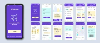
One of the most visible uses of graphics in airline ticketing is the seat selection interface. Instead of choosing from a list of seat numbers, users are now presented with a dynamic, graphic-rich layout of the airplane’s seating plan. The seats are color-coded based on availability, price, or class—economy, business, or premium—allowing travelers to make informed decisions visually. Some platforms even offer 3D previews of cabin interiors, giving users a clear idea of legroom, seat width, and nearby amenities.
Furthermore, flight comparison tools utilize graphic charts and timeline bars to compare various airlines, travel durations, and layover times at a glance. These visual elements eliminate the need for users to sift through lengthy textual data. A traveler can instantly see which option offers the shortest duration, fewest stops, or best value for money, thanks to infographics and interactive sliders.
Computer graphics are also used to enhance calendar views in flight search interfaces. When booking round-trip tickets, users can explore price trends across days or months with color-coded date pickers. These tools highlight cheaper fare windows and help travelers plan trips within budget. The visual cues speed up decision-making and reduce booking errors.
On mobile apps, graphics are especially crucial for guiding users through small-screen environments. Iconography, animations, and responsive layouts ensure that even complex booking flows remain user-friendly. Transitions and progress bars visually indicate steps such as passenger details, payment, and confirmation—making the process feel smooth and intuitive.
Personalized ticketing is another area benefiting from computer graphics. Many platforms now display visuals based on user preferences—frequent flyer programs, favorite airlines, or travel history. For example, if a user often selects window seats, the interface might subtly highlight those options. Graphical prompts such as badges, tags, and priority alerts help travelers quickly identify upgrades, discounts, or loyalty perks.
Moreover, computer graphics aid in accessibility. Visually impaired users can benefit from high-contrast color schemes, enlarged visual elements, and simplified layouts. These features ensure inclusivity, allowing all users to navigate airline systems confidently.
Airline apps also include live graphics post-booking. Flight tracking visualizations display animated maps showing aircraft movement in real time. Boarding passes are visually formatted for quick scanning, and boarding gates or delays are communicated through color changes and alert animations.
Back-end systems also benefit from computer graphics. Airline staff use dashboard interfaces filled with visual widgets, graphs, and icons to monitor bookings, reschedules, and passenger flow. This makes it easier to manage high-volume traffic during peak seasons and emergencies.
Despite these advantages, challenges persist. Overuse of flashy graphics or cluttered layouts can overwhelm users, especially elderly travelers unfamiliar with digital tools. Hence, there’s a growing emphasis on UI minimalism, where visual clarity and user flow take precedence over decorative elements.
In conclusion, computer graphics have made airline ticketing interfaces more engaging, efficient, and user-centric. From booking to boarding, every step of the airline travel experience is now enhanced by thoughtful visual design. As technology advances further, we can expect even more immersive and AI-integrated interfaces tailored to individual needs.
Join the Conversation:
Do you prefer booking your flights through mobile apps or desktop websites?
Have modern visuals made airline ticketing easier for you?
What features do you wish were included in today’s ticketing interfaces?
Let us know your thoughts in the comments!