Remote sensing has revolutionized how we view our planet and outer space. By capturing data from satellites, drones, or high-altitude aircraft, scientists can observe ecosystems, monitor weather patterns, detect changes in climate, and even map distant planets. However, the raw data collected through these methods is often unintelligible to the human eye.
That’s where computer graphics play a critical role. Through advanced visualizations, these vast and complex data sets are transformed into understandable, actionable insights. From color-coded maps to 3D terrain models, graphics are essential in remote sensing for both scientific research and practical applications.
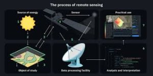
Remote sensing involves collecting data about a surface (usually Earth or other planets) without direct contact. Sensors detect radiation reflected or emitted from the surface in various electromagnetic bands (visible, infrared, microwave), and these signals are then converted into usable data formats.
But this raw data is mostly numerical or pixel-based. Graphics help scientists visualize it, making analysis and communication more efficient and effective.
Have you ever explored satellite images or 3D maps online?
Do you think visualization tools help raise awareness about environmental issues?
Which aspect of remote sensing graphics fascinates you the most—weather, space, or earth science?
Share your views in the comments!
That’s where computer graphics play a critical role. Through advanced visualizations, these vast and complex data sets are transformed into understandable, actionable insights. From color-coded maps to 3D terrain models, graphics are essential in remote sensing for both scientific research and practical applications.
What Is Remote Sensing?
Remote sensing involves collecting data about a surface (usually Earth or other planets) without direct contact. Sensors detect radiation reflected or emitted from the surface in various electromagnetic bands (visible, infrared, microwave), and these signals are then converted into usable data formats.
But this raw data is mostly numerical or pixel-based. Graphics help scientists visualize it, making analysis and communication more efficient and effective.
The Role of Graphics in Interpreting Space Data
1. False Color Composites
- Graphics tools are used to assign visible colors to non-visible wavelengths (e.g., infrared).
- For example, vegetation may appear bright red in satellite images to highlight plant health.
2. 3D Terrain Modeling
- Elevation data from satellites is rendered as 3D landscapes using shading and color gradients.
- Used in geological surveys, flood mapping, and planetary topography analysis.
3.Heat Maps and Spectral Imaging
- Graphics software visualizes temperature differences or spectral bands to detect forest fires, ocean temperatures, or urban heat islands.
4. Time-Lapse Animations
- Computer-generated sequences show how landscapes evolve over days, months, or decades.
- Essential for monitoring glacier retreat, urban expansion, or desertification.
5. Data Fusion Visualizations
- Combining data from multiple sensors (optical, radar, lidar) into a single unified image.
- Enhances accuracy and insight, especially in weather prediction and military surveillance.
Applications in Earth Sciences and Beyond
 Environmental Monitoring
- Detecting deforestation, coral reef bleaching, and glacier melting.
- Analyzing air pollution or water contamination levels.
 Planetary Exploration
- Visualizing Martian terrain, lunar craters, and asteroid surfaces.
- Mission planners use graphics to determine rover paths and landing sites.
 Disaster Management
- Real-time simulation of hurricanes, earthquakes, floods, and wildfires.
- Aids in early warning systems and evacuation planning.
 Agriculture & Land Use
- Monitoring crop health, irrigation needs, and land conversion.
- Farmers use satellite visuals for precision farming and yield prediction.
 Urban Planning & Infrastructure
- Graphics help city planners analyze land usage, transportation patterns, and urban heat distribution using satellite data overlays.
Tools and Platforms for Remote Sensing Graphics
- ENVI and ERDAS Imagine: Professional tools used for satellite image processing.
- Google Earth Engine: A cloud-based platform to visualize and analyze geospatial data.
- QGIS and ArcGIS: GIS software for layering graphical data onto maps.
- NASA Worldview: Offers interactive visualization of global satellite imagery.
Why Graphics Matter in Space Science
- Simplify Complexity: Raw satellite data is vast; graphics make it manageable.
- Improve Communication: Easy-to-understand visuals help governments, media, and the public grasp technical findings.
- Aid in Decision Making: From disaster relief to environmental policy, visual data improves responsiveness and strategic planning.
- Enable Real-Time Monitoring: Dynamic visuals allow live tracking of storms, fires, and environmental shifts.
Challenges in Visualizing Remote Sensing Data
- Data Volume: Petabytes of satellite data need to be filtered and rendered efficiently.
- Accuracy vs Aesthetics: Striking a balance between visual appeal and scientific precision.
- Interpretation Bias: Misinterpretation of color scales or visual exaggerations can mislead viewers.
- Resolution Limits: Sometimes the sensors’ spatial resolution isn't enough to capture small-scale changes, affecting image clarity.
Join the Conversation
Have you ever explored satellite images or 3D maps online?
Do you think visualization tools help raise awareness about environmental issues?
Which aspect of remote sensing graphics fascinates you the most—weather, space, or earth science?
Share your views in the comments!